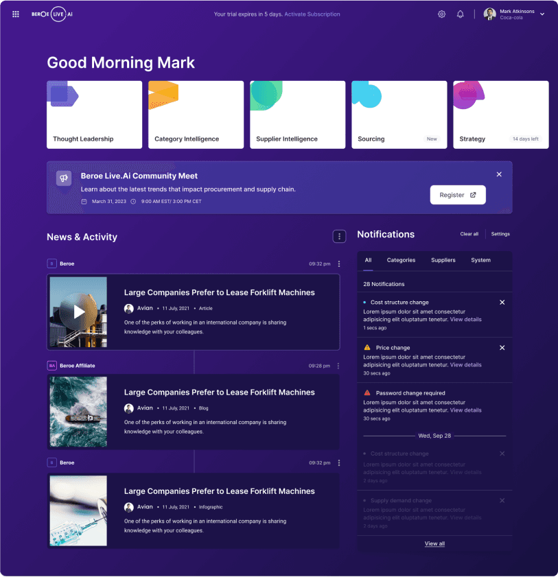
Beroe’s platform is a robust ecosystem for procurement professionals to explore risks, monitor suppliers, and act on real-time intelligence. But the homepage/dashboard didn’t reflect that power. It overwhelmed new users with dense modules and under-served returning users with repetitive, unclear pathways.
Previous State
Reframing the Homepage as a Journey/Map
Instead of keeping the homepage as a static dashboard, we used scenario-based product design inspired by travel apps and maps to focus on user intent.
We asked: What if the homepage acted like a concierge?
This led to four guiding questions that formed the foundation of our redesign:
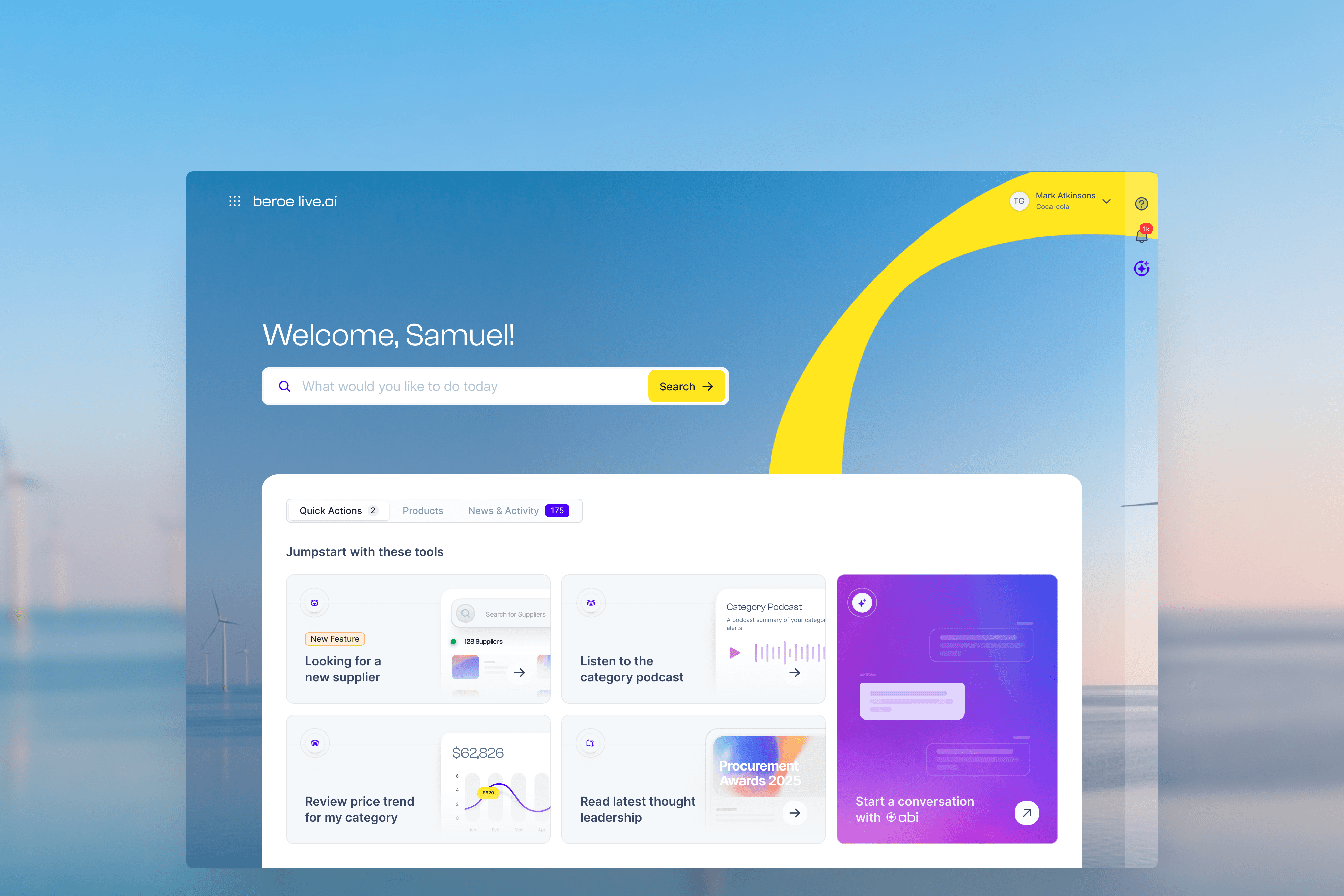
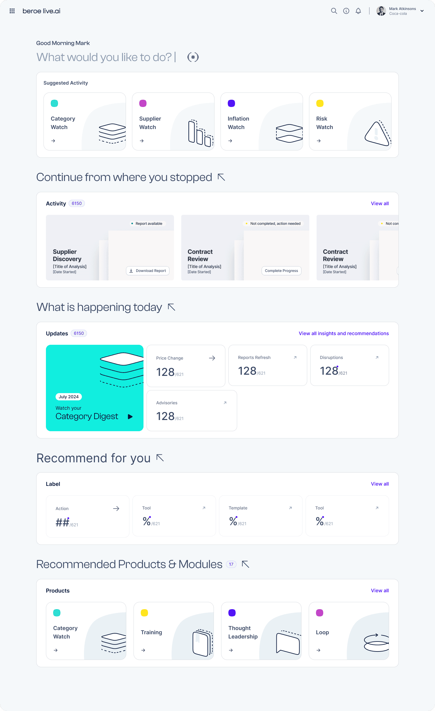
What would you like to do?
Open-ended, goal-oriented exploration using search or modules.Continue from where you stopped?
Contextual access to recent activity and previously visited pages.What is happening today?
Time-sensitive data, critical updates, or relevant procurement insights.What should I discover?
Recommended products and modules based on user role or usage pattern.
Initial Proof of Concept in Framer
Building the Experience
Each question was mapped to a visual and functional module:
Search as Starting Point: A persistent search bar allowed users to begin anywhere, whether it was looking up a supplier, module, or insight.
Abi as Companion: Abi guided users through actions, answered queries, and surfaced suggestions without disrupting flow.
Smart Modules & Recommendations: The system used behavioral data to recommend features, tools, and modules, eliminating the need for tutorial-based onboarding.
Contextual Intelligence: Notifications, tasks, and alerts were grouped and prioritized to surface only what was relevant at any point in time.
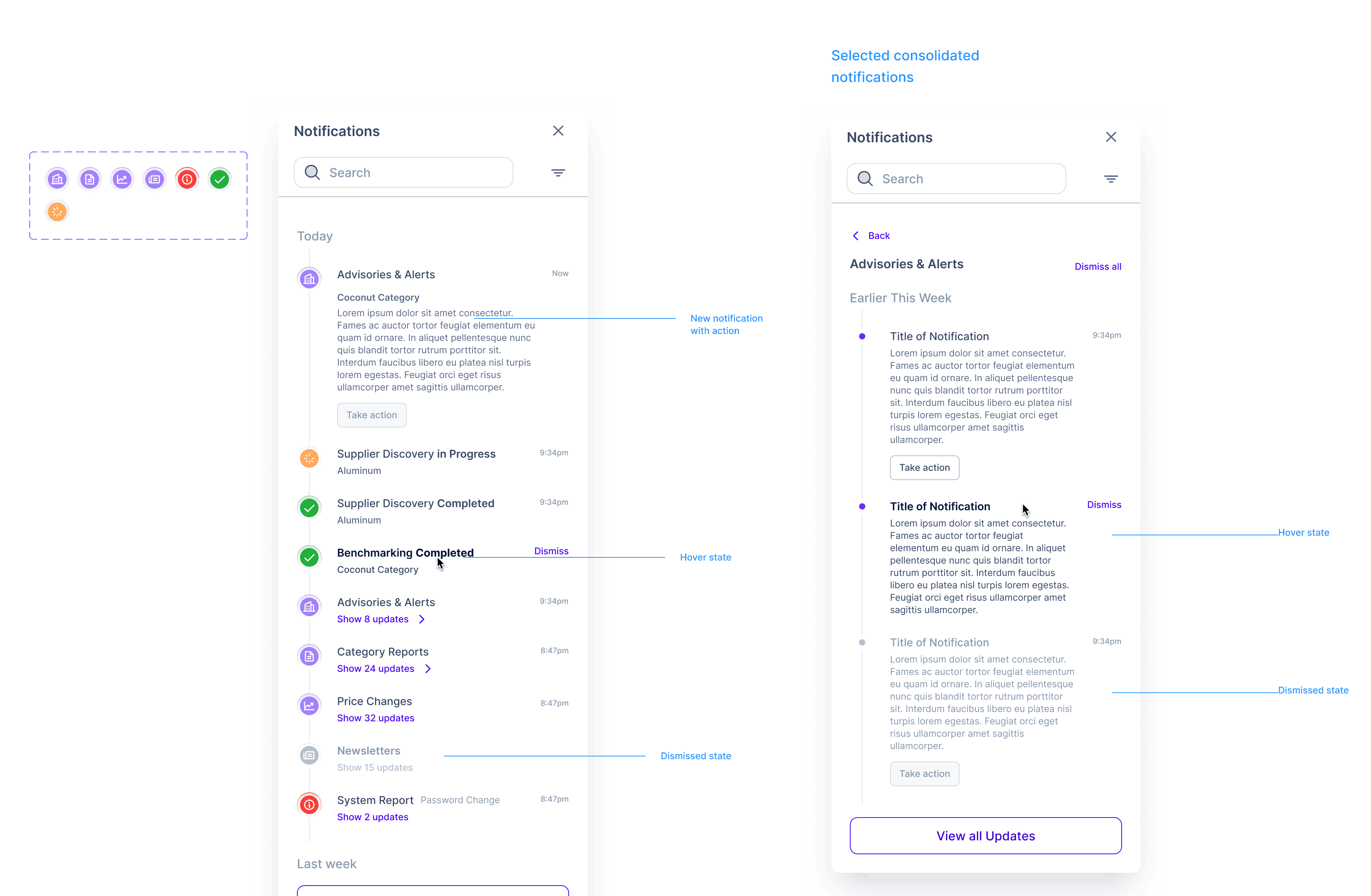
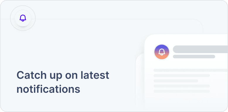
Notification Consolidation & Drawer Design
Our users typically receive about 5k alerts, depending on the frequency of alerts they require, the number of suppliers, and the categories in their portfolio. To manage this volume effectively, we moved notifications to a drawer experience. This included adding consolidation features to group similar alerts, iconography to identify and categorize them quickly, and support for system alerts to ensure critical information stands out without overwhelming the main interface.
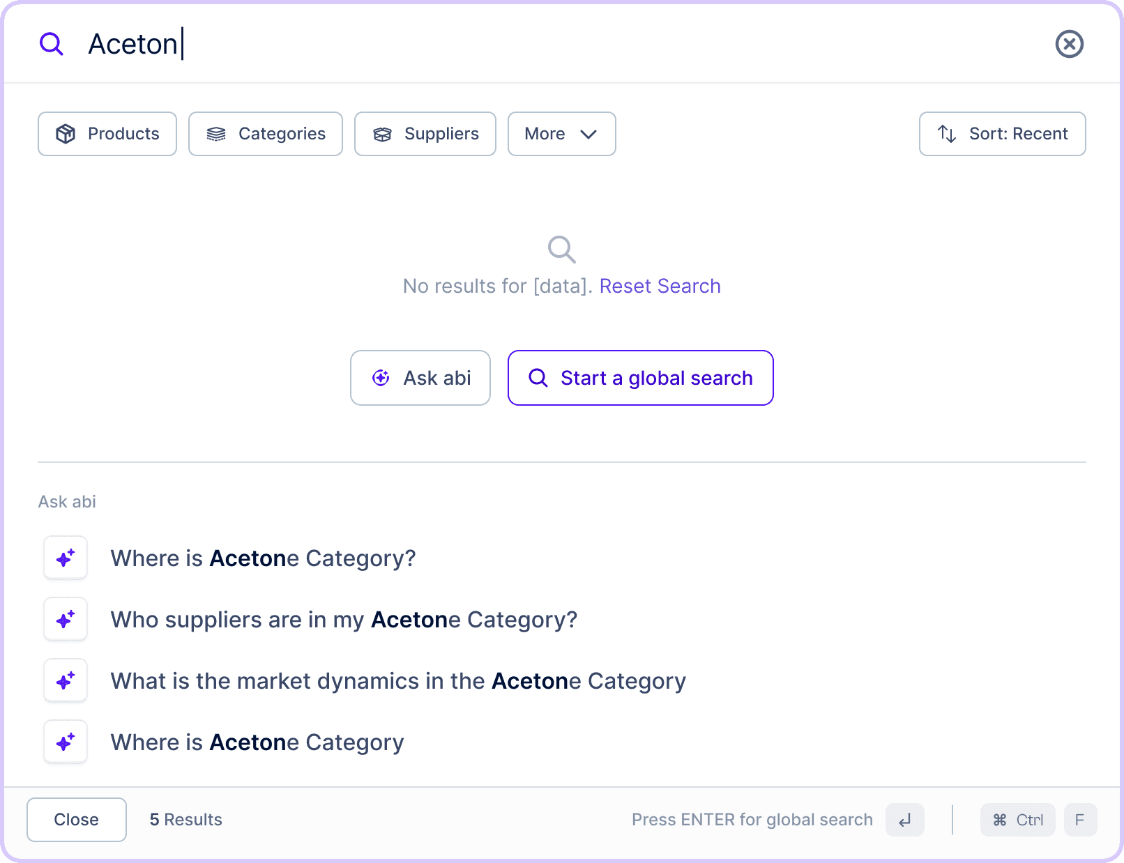
The Shift: Compressing Complexity into Search
During testing, we noticed users preferred a single entry point: search. So, we pivoted boldly - turning search into the homepage itself:
Search evolved from a simple tool into an intelligent, predictive experience.
Abi was embedded in search results to guide, complete, or anticipate tasks.
The four guiding questions were now addressed implicitly through dynamic search behaviors, such as showing recent history, real-time data, or recommended actions.
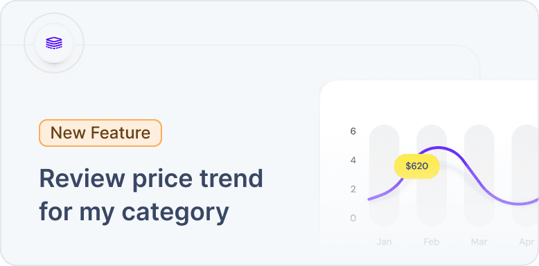
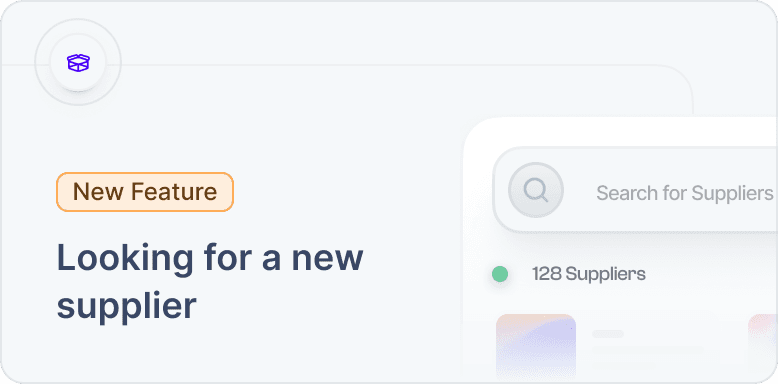
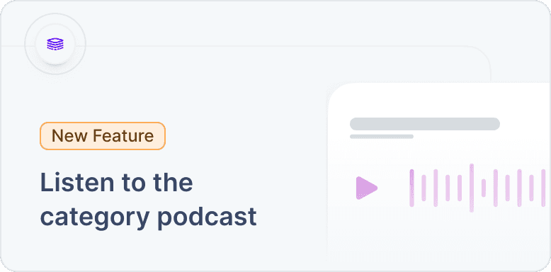
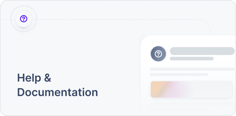
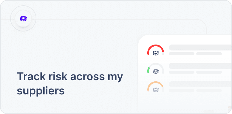
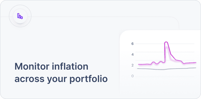
Quick Actions, Illustrated Delight
To boost engagement and reduce decision fatigue, we added Quick Action Cards—a series of dynamic prompts tailored to user behavior. These cards:
Surface contextual suggestions based on recent activity or role.
Feature custom illustrations to spark curiosity.
Highlight new features or actions
Act as a lightweight alternative to full tutorials, gently nudging users toward meaningful tasks.

From Figma to Framer to Subframe
As the prototypes matured, we transitioned to Subframe to generate clean React code integrated with Tailwind CSS. This step streamlined developer handoff by providing production-ready components that maintained the fidelity of our interactions and styles, reducing implementation time and potential discrepancies.
Reflections & Conclusion
Systems Can Be Simple, But Not Simplistic
Compressing a multi-module homepage into a single search experience required bold thinking, but it paid off.
AI Needs Integration, Not Decoration
Embedding Abi within the journey, rather than tacking it on, allowed it to become useful, not intrusive. AI must live where decisions happen.